Data visualization
SarcAsM provides various high-level functions in the class Plots, see API reference, for publication-grade visualizations using matplotlib. The class PlotUtils provides useful utility functions to polish figures.
These functions are modular and designed to work with matplotlib.axis instances, allowing you to integrate them seamlessly into complex figure designs. Below are three examples:
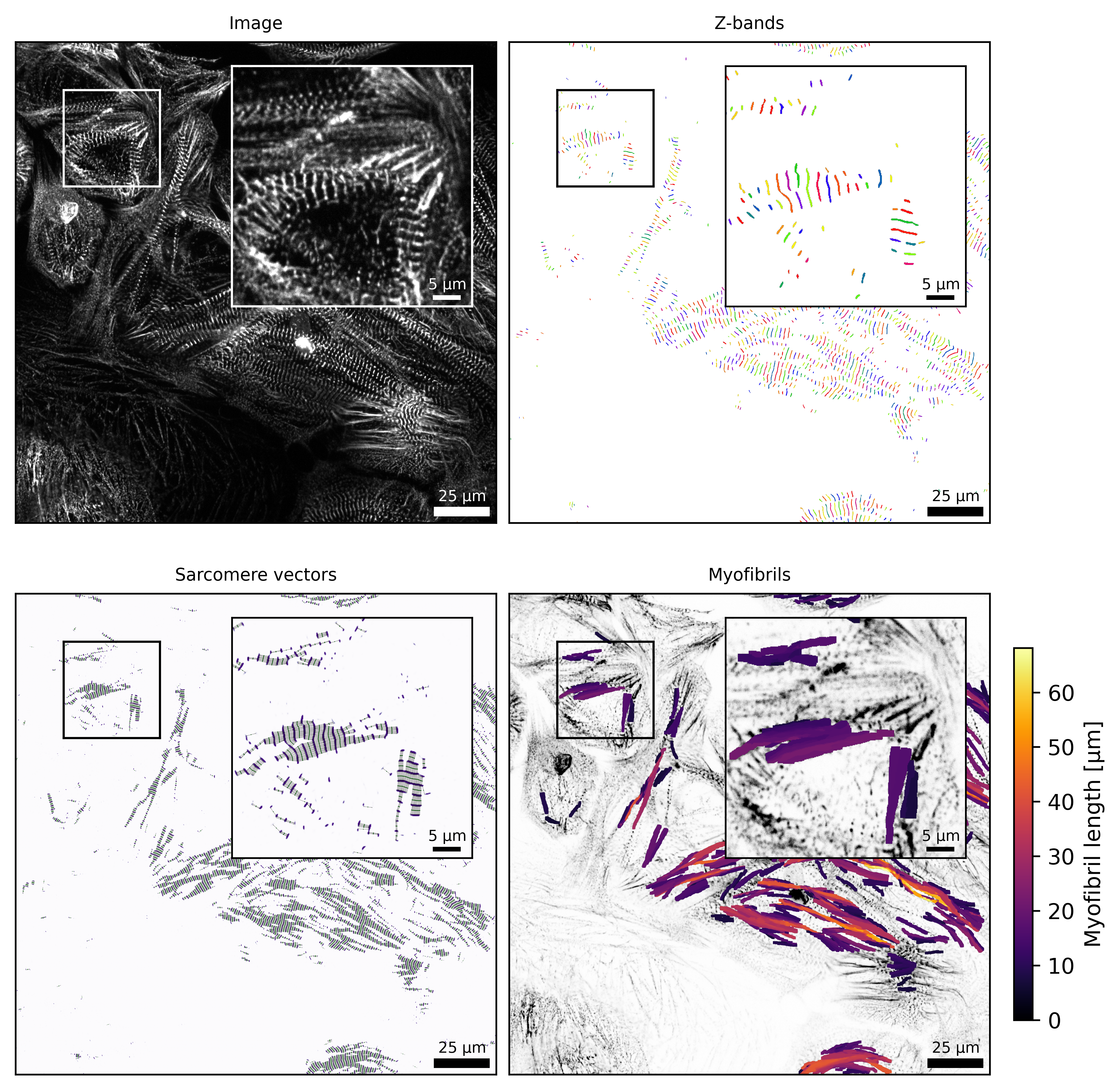
Example: visualization of structure analysis
[5]:
from sarcasm import Structure

# open previously analyzed TIF-file
filename = '../../_test_data/20211115_ACTN2_CMs_96well_control_12days.tif'
sarc = Structure(filename)
[6]:
from sarcasm import PlotUtils, Plots
import matplotlib.pyplot as plt

# create a multi panel figure
mosaic = """
ab
cd
"""

fig, axs = plt.subplot_mosaic(mosaic=mosaic, figsize=(PlotUtils.width_2cols, PlotUtils.width_2cols), constrained_layout=True, dpi=600)

# select frame
frame = 30

# specify zoom inset
zoom_region = (200, 600, 200, 600)
inset_bounds = (0.45, 0.45, 0.5, 0.5)

# image
Plots.plot_image(axs['a'], sarc, frame=frame, title='Image', zoom_region=zoom_region, inset_bounds=inset_bounds)

# Z-band segmentation
Plots.plot_z_segmentation(axs['b'], sarc, frame=frame, title='Z-bands', zoom_region=zoom_region, inset_bounds=inset_bounds)

# sarcomere vectors
Plots.plot_sarcomere_vectors(axs['c'], sarc, frame=frame, title='Sarcomere vectors', zoom_region=zoom_region, inset_bounds=inset_bounds)

# myofibrils
Plots.plot_myofibril_length_map(axs['d'], sarc, frame=frame, title='Myofibrils', zoom_region=zoom_region, inset_bounds=inset_bounds)

# fig.savefig('tutorial_data_visualization.png')
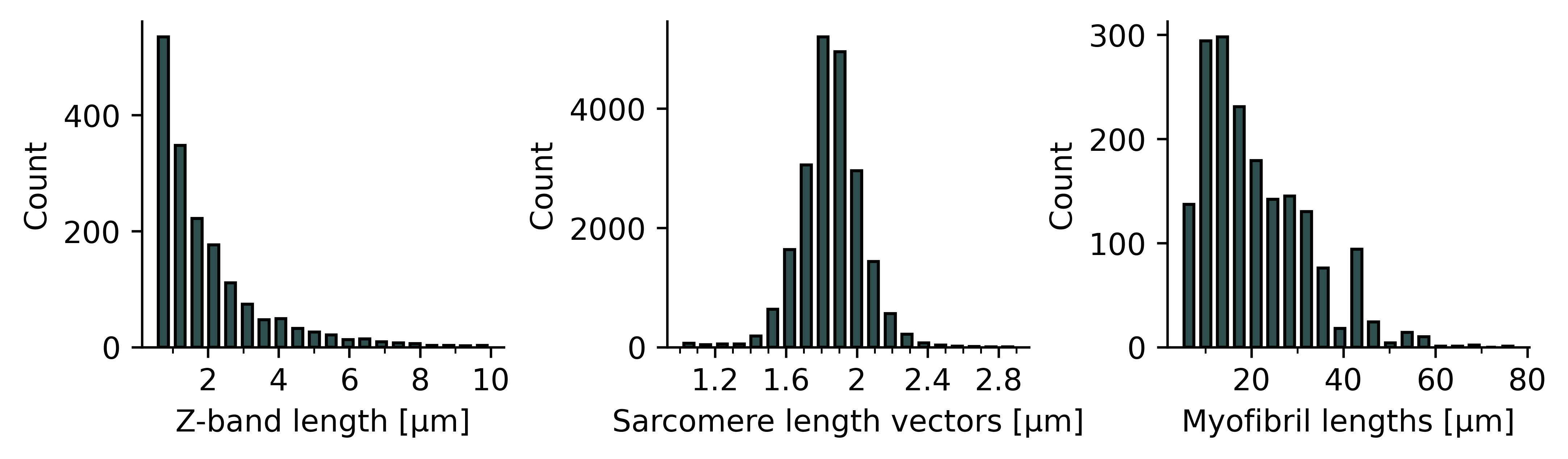
Example: boxplots of structure features
[7]:
from sarcasm import PlotUtils, Plots
import matplotlib.pyplot as plt

# create a multi panel figure
mosaic = """
abc
"""

fig, axs = plt.subplot_mosaic(mosaic=mosaic, figsize=(PlotUtils.width_2cols, 2), constrained_layout=True, dpi=600)

# select frame
frame = 30

# z-band length
Plots.plot_histogram_structure(axs['a'], sarc, feature='z_length', frame=frame, range=(0.5, 10))
PlotUtils.polish_xticks(axs['a'], 2, 1)

# sarcomere length
Plots.plot_histogram_structure(axs['b'], sarc, feature='sarcomere_length_vectors', frame=frame)
PlotUtils.polish_xticks(axs['b'], 0.4, 0.1)

# myofibril length
Plots.plot_histogram_structure(axs['c'], sarc, feature='myof_length', frame=frame)
PlotUtils.polish_xticks(axs['c'], 20, 10)

# fig.savefig('tutorial_histograms.png')
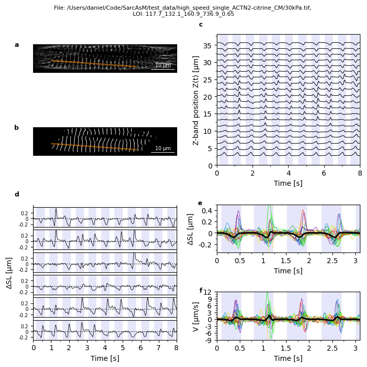
Example: visualization of LOI motion analysis
This multi-panel figure is also included in our package, see Plots.plot_loi_summary_motion.
[8]:
from sarcasm import Utils, Motion
from sarcasm import PlotUtils, Plots
import matplotlib.pyplot as plt

# open LOI
filepath = '../../test_data/high_speed_single_ACTN2-citrine_CM/30kPa.tif'
lois = Utils.get_lois_of_file(filepath)
file, loi = lois[1]  # select LOI of TIF file
# initialize LOI
mot = Motion(file, loi)

# create a multi panel figure
mosaic = """
aaaccc
bbbccc
dddeee
dddfff
"""

fig, axs = plt.subplot_mosaic(mosaic, figsize=(PlotUtils.width_2cols, PlotUtils.width_2cols), constrained_layout=True)

# plot parameter
t_lim = (0, 8)
number_contr = 3
t_lim_overlay = (-0.1, 3)

title = f'File: {mot.filepath}, \nLOI: {mot.loi_name}'
fig.suptitle(title, fontsize=PlotUtils.fontsize)

# image cell w/ LOI
Plots.plot_image(axs['a'], mot, show_loi=True)

# U-Net cell w/ LOI
Plots.plot_z_bands(axs['b'], mot)

# kymograph and tracked z-lines
Plots.plot_z_pos(axs['c'], mot, t_lim=t_lim)

# single sarcomere trajs (vel and delta slen)
Plots.plot_delta_slen(axs['d'], mot, t_lim=t_lim)

# overlay delta slen
Plots.plot_overlay_delta_slen(axs['e'], mot, number_contr=number_contr, t_lim=t_lim_overlay)

# overlay velocity
Plots.plot_overlay_velocity(axs['f'], mot, number_contr=number_contr, t_lim=t_lim_overlay)

PlotUtils.label_all_panels(axs)

# fig.savefig('tutorial_loi.png')