

At a Glance
Bar charts allow the graphic representation, in rectangular format, of the status of a variable.
Only rectangular type objects can be used as bar charts.
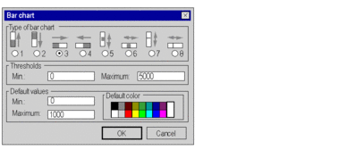
Bar chart parameter screen
The screen below allows parameterizing of animated rectangles in bar chart format.
Description
The table below describes the settings that you may define.
Attribute |
Description |
|---|---|
Type of bar chart |
|
Thresholds |
Values indicating the range of status displayed. When the associated variable value is equal to the minimum threshold value, the bar chart is empty. When this value is equal to the maximum limit value, the bar chart is full (the rectangle’s color). By default these values are set to 0 (minimum) and 1000 (maximum). |
Default values |
Values that indicate the thresholds from which the bar chart is displayed with the default color. The bar chart uses the default color when the associated variable value is:
The colors palette contains 16 predefined colors and provides access to the extended colors parameter screen. |