Model evaluation
Evaluation metrics
Evaluation metrics are used to quantify the performance of a model (once it has been trained) for a given problem, and this throughout a model's lifecycle.
from sklearn import metrics
Warning on metrics !
Metrics must be chosen according to the characteristics of the task: classification, regression, clustering...
A metric alone gives you only a partial view of a model's performance on a task: it is often desirable to compare different evaluation metrics.
In addition, the metric doesn't necessarily give you any information about its interpretability, so you need to inspect your model through complementary analyses such as analysis of the relationships between the variable to be predicted and the features, or of the relationships between the features themselves.
No single model can offer the best performance for every task (No Free Lunch Theorem)!
Baseline score
Always calculate the score of a reference model to serve as a point of comparison for your evaluation metric.
This may be a result from the state of the art in the field under study, for example:
- a physical model for predicting global warming
- human performance on the same task
Or else a stupid model giving a stereotyped response, for example:
- giving a random response
- for classification: predict the most frequent class
- for regression: predict a measure of central tendency (mean, median, mode)
- ...
DummyClassifier for classifications :
import numpy as np
from sklearn.dummy import DummyClassifier
X = np.array([-1, 1, 1, 1])
y = np.array([0, 1, 1, 1])

dummy_clf = DummyClassifier(strategy="most_frequent")
dummy_clf.fit(X, y)

dummy_clf.predict(X)

dummy_clf.score(X, y)
0.75
DummyClassifier for regressions :
import numpy as np
from sklearn.dummy import DummyRegressor
X = np.array([1.0, 2.0, 3.0, 4.0])
y = np.array([2.0, 3.0, 5.0, 10.0])

dummy_regr = DummyRegressor(strategy="mean")
dummy_regr.fit(X, y)

dummy_regr.predict(X)

dummy_regr.score(X, y)
0.0
Mean Squared Error (MSE)
It measures the mean-square difference between the $y$ labels and their predicted values $\hat y$ :
Important points
- useful for penalizing large errors
- very sensitive to outliers
- does not give error direction
- does not give the same order of magnitude as $y$.
Root Mean Squared Error (MSE)
Using the square root gives an error of the same order of magnitude as the labels $y$
Mean Absolute Error (MAE)
It measures the mean of the absolute difference (norm $L_1$) between labels $y$ and their predicted value $\hat y$ :
Important points :
- Useful for comparing models
- less sensitive than MSE to outliers
- does not give error direction
- give the same order of magnitude as $y$.
Max Error
It measures the greatest error made by the model:
Use Max error when you want to limit the magnitude of errors.
The coefficient of determination $R^2$.
Measures the proportion of variance observed on $y$ that is explained by the features $X$ in the dataset. It assesses the model's quality of fit (goodness of fit) compared with a stupid model that would always predict $\bar y$ (the mean).
- $R^2$ = 1 characterizes a model that fits the data perfectly
- $R^2$ ~ 0 characterizes a model that does no better than the stupid model
- $R^2$ < 0 characterizes an even worse model!
Important points
- gives a standardized error measure (between -1 and 1)
- can be used to determine whether or not the chosen model is better than a stupid model.
Examples of metric comparison during cross-validation
import pandas as pd
from sklearn.model_selection import cross_validate

cv_results = cross_validate(mlp_model, X_train, y_train, cv=5,
                            scoring = ['neg_mean_absolute_error',
                                       'neg_mean_squared_error',
                                       'max_error','r2'])
pd.DataFrame(cv_results)
| fit_time | score_time | test_neg_mean_absolute_error | test_neg_mean_squared_error | test_max_error | test_r2 | |
|---|---|---|---|---|---|---|
| 0 | 3.835665 | 0.008013 | -30.412854 | -2321.110081 | -392.599692 | 0.928451 |
| 1 | 3.393434 | 0.010037 | -28.486267 | -2060.943748 | -464.888348 | 0.938005 |
| 2 | 3.495894 | 0.011007 | -28.249311 | -1979.778788 | -280.844825 | 0.938423 |
| 3 | 4.059982 | 0.008575 | -28.350779 | -2177.317791 | -440.987206 | 0.934958 |
| 4 | 5.503218 | 0.018209 | -27.754710 | -1900.744156 | -385.141612 | 0.941775 |
cv_results['test_r2'].mean()
0.9363221440235678
- We often distinguish 3 types of classification
binary{$C_0$,$C_1$},multiclass{$C_1 \ldots C_n $}, etmutlilabel{ {$C_1$,$D_1$},$\ldots$,$C_n$,$D_n$} }
Confusion matrix
In binary classification tasks, we distinguish two types of error, which can be represented by a Confusion matrix

Example of a confusion matrix for multiclass classification
We train an SVM on the iris data set:
import matplotlib.pyplot as plt

from sklearn import svm, datasets
from sklearn.model_selection import train_test_split
from sklearn.metrics import ConfusionMatrixDisplay

# import some data to play with
iris = datasets.load_iris()
X = iris.data
y = iris.target
class_names = iris.target_names

# Split the data into a training set and a test set
X_train, X_test, y_train, y_test = train_test_split(X, y, random_state=0)

# Run classifier, using a model that is too regularized (C too low) to see
# the impact on the results
classifier = svm.SVC(kernel="linear", C=0.01).fit(X_train, y_train)
The confusion matrix is often represented as a heat map:
confmat = ConfusionMatrixDisplay.from_estimator(
        classifier,
        X_test,
        y_test,
        display_labels=class_names,
        cmap=plt.cm.Blues,
)
confmat.ax_.set_title("Confusion matrix");

Many classification metrics are based on the confusion matrix ! (see the dedicated wikipedia page for more details)
Accuracy score
This is the simplest score, corresponding to the fraction of correct answers:
Be careful! This measure gives an over-confident score, especially when the dataset to be processed contains unbalanced classes. In this case, the balanced accuracy score is preferable.
Balanced accuracy score
Recall / sensitivity / true positive rate
This metric measures the classifier's ability to detect true positives among positive samples:
Recall is preferred when it is important to identify the occurrences of a class, for example in a disease screening test.
Precision
This metric measures the classifier's ability to detect true positives among positive predictions:
Precision is preferred when it's important to correctly identify a class, for example when using a search engine.
F-score
It's a metric that combines, with a weight, precision and recall. The F1 score is often used:
but the weighting can be generalized to any value:
- The best $F_\beta$ score is 1, the worst 0
- Gives the same weight to recall and precision, if $\beta > 1$ we favor recall
This scikit-learn function returns a report integrating several classification metrics:
- precision
- recall
- F1-score
from sklearn.metrics import classification_report

print(classification_report(y_test,classifier.predict(X_test) , target_names=class_names))
              precision    recall  f1-score   support

      setosa       1.00      1.00      1.00        13
  versicolor       1.00      0.62      0.77        16
   virginica       0.60      1.00      0.75         9

    accuracy                           0.84        38
   macro avg       0.87      0.88      0.84        38
weighted avg       0.91      0.84      0.84        38
Specificity / selectivity / true negative rate
This metric measures the classifier's ability to detect true negatives among negative samples:
The ROC curve (Receiver Operating Characteristic) is a measure of the performance of a binary classifier, derived from signal detection theory (it was used to separate radar signals from background noise).
It is determined by calculating the True positive rate (or recall) versus the True negative rate (1-specificity) by varying a discrimination threshold. The metric then consists of measuring the area under the ROC curve (AUC) as a score.

For an interactive example of its construction, see this website.
Although some of the metrics presented may have multilabel variants, there are metrics specific to multilabel classification tasks (which involve predicting several labels at the same time).
Some of these are described and implemented in scikit-learn, such as the coverage error, label ranking average precision, ranking loss...
Analysis of relationships between variables
Using one or more metrics is a first step, but it's not enough to understand the relationships between variables and their impacts on predictions.
Analysis of relationships between features
This involves analyzing the relationships between features, by examining the importance of features used by the model.
Some models are natively equipped with such a score:
- the coefficients of a regression.
- the importance of the features used in the partitions of a decision tree.
Analysis of the relationship between features and target variable
This involves analyzing the relationships between predictors and target variables, in particular their degree of dependence.
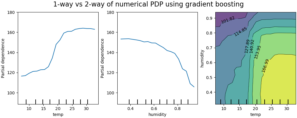
Partial dependency analysis (partial dependence plots - PDP)
PDP graphs are often used to represent the dependence of the response variable, with a sub-group of features of interest (usually a small number of the most important ones), compared with all other features.
Example of PDP on a predictive model of bicycle rental with the variables temperature and humidity
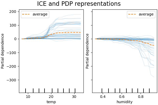
ICE represents the dependence between the response variable and a representative subgroup of features, for each obervation separately. An interest feature is generally represented by an ICE grapics (for ease of reading)
ICE example on the same bike rental prediction model:
For more details on the partial dependency analysis of the variables in this data set, see the complete example on scikit-learn